
I took the post as a joke as the ground in the picture lacks wetness.
News General Updates
- Thread starter DH_The_ThemeParkFaniac
- Start date
You are using an out of date browser. It may not display this or other websites correctly.
You should upgrade or use an alternative browser.
You should upgrade or use an alternative browser.
Register or Login to Hide This Ad for Free!


I wonder what they’re gonna rename the Waterpark for next year…
Hopefully they bring back Splashwater Kingdom!
Hopefully they bring back Splashwater Kingdom!

SweetBabyJames
Conservative Coaster Connoisseur
Wow, all of that footage is actually from the Great Escape. That is a very nice change to see compared to the Six Flags days.
It’s been the WHOLE Summer, Outlaw’s been closed for the whole SUMMER!

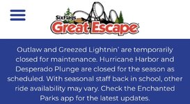
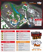
There’s new Scary shows in this year’s Fright Fest
Fright Fest at Great Escape | Halloween Event - Great Escape Parks
Fright Fest at Great Escape | Halloween Event - Great Escape Parks
Last edited:
Second thought, it looks like they are redesigning the logo soon..I know it doesn’t really matter, but I really hope they redesign the logo without the Six Flags font.
SweetBabyJames
Conservative Coaster Connoisseur
I'm using my best design skills and guessing what the new Great Escape logo will look like. My estimate is that Enchanted Parks will want a uniform look across all the parks in their portfolio so I took inspiration from the Mid America Adventure Logo. Great Escape has a water park and roller coasters so I kept those elements. I added a stylized mountain to reflect the scenic location of the Great Escape. What do you think? I included the Mid America logo for comparison.

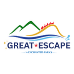
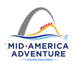

I hate it. And as such it looks exactly like something EnParks would do. Fantastic job.

Yeah, @SweetBabyJames nailed it. Looks precisely like what I imagine we should be expecting... unfortunately.
The current logo obviously needs to lose the Six Flags and I think changing the font is reasonable too, but I'd want the park's branding to move in a more rustic direction, not this generic, sleek, modern, soulless look.
You can get away with "modernizing" SFStL's branding because any semblance of charm or history has long since been drained from that property. It is now just a generic amusement park. That is very much not true up at Great Escape. Enchanted needs to highlight and capitalize on what makes Great Escape uniquely desirable—the fact that it's a family theme park centered on nostalgia and fairy tales up in the mountains. If they try to make it compete as a standard amusement park (which is what a modern, swoosh-type, sans-serif logo relays to customers), it's not gonna go well.
The current logo obviously needs to lose the Six Flags and I think changing the font is reasonable too, but I'd want the park's branding to move in a more rustic direction, not this generic, sleek, modern, soulless look.
You can get away with "modernizing" SFStL's branding because any semblance of charm or history has long since been drained from that property. It is now just a generic amusement park. That is very much not true up at Great Escape. Enchanted needs to highlight and capitalize on what makes Great Escape uniquely desirable—the fact that it's a family theme park centered on nostalgia and fairy tales up in the mountains. If they try to make it compete as a standard amusement park (which is what a modern, swoosh-type, sans-serif logo relays to customers), it's not gonna go well.
Last edited:
SweetBabyJames
Conservative Coaster Connoisseur
I agree with what you said @Zachary . Do I think Great Escape should give their logo a more rustic look with a whimsical vibe? Absolutely! Do I think we will get that? Probably not. Unfortunately, I think the closest to whimsical / fairy tale we are going to get are those 3 little yellow star shapes to the left of the park name.Yeah, @SweetBabyJames nailed it. Looks precisely like what I imagine we should be expecting... unfortunately.
The current logo obviously needs to lose the Six Flags and I think changing the font is reasonable too, but I'd want the park's branding to move in a more rustic direction, not this generic, sleek, modern, soulless look.
You can get away with "modernizing" SFStL's branding because any semblance of charm or history has long since been drained from that property. It is now just a generic amusement park. That is very much not true up at Great Escape. Enchanted needs to highlight and capitalize on what makes Great Escape uniquely desirable—the fact that it's a family theme park centered on nostalgia and fairy tales up in the mountains. If they try to make it compete as a standard amusement park (which is what a modern, swoosh-type, sans-serif logo relays to customers), it's not gonna go well.
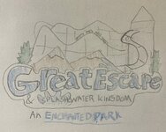
I mean, i did this fanmade rebrand two months ago, I wonder if they noticed and decided to use that one

SweetBabyJames
Conservative Coaster Connoisseur
Honestly, yours has a little more creativity than the enchanted logo.I mean, i did this fanmade rebrand two months ago, I wonder if they noticed and decided to use that one
View attachment 45022
Thanks man! I’ve honestly thought a generic Boomerang coaster got too much popular for the logo and did something about it with an actual fan favorite to the park, The Comet.. along with some other stuffHonestly, yours has a little more creativity than the enchanted logo.
Share:
Consider Donating to Hide This Ad