Register or Login to Hide This Ad for Free!
Status
The first entry in this thread is a WikiPost. As such, it can be edited by anyone with the appropriate permissions.

Manufacturer
ZIERER

Model
Elevated Seating Coaster w/ Vertical Drop Element

Hamlet
Oktoberfest (Germany)

Official Opening
May 18, 2012

Soft Opening
May 11, 2012

Tallest Drop
88ft


Top Speed
53mph

Inversion Count
0

Launch Segments
2

Riders Per Train
16

Number of Trains
5

Height Requirement
48in


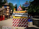
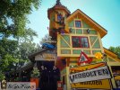
Verbolten is an indoor/outdoor ZIERER Elevated Seating Coaster that features a Vertical Drop Element. It officially opened in mid-May 2012 on the site formally occupied by the Arrow Suspended Coaster, Big Bad Wolf.


Videos​

Development Documentary​

Ride Recordings​

On-Ride Videos​

Backstage Footage​

 
Last edited by a moderator:
Um, no. It was useful, the park just decided to be lazy an replace it with an un-useful thing.

And yet again you're comparing two very different things, as if they were the same.
 
Party Rocker said:
All theming is clearly the same and should be top priority no matter what.

So are you trying to say that LNM's cave is the same as Verbolten's queue line? Because that's basically what you're saying. No theming is the same, so you're really comparing things that are completely different, which is an invalid comparison.
 
No matter how small and insignificant it may be, theming is still everything. In fact, it is the little things that count the most.
 
Theming should be used to enhance a ride.

The sign and Pompeii's props were nice touches, but they're not integral to the actual ride atmosphere. Most people never notice the sundial or the missing sign.

The sundial itself acts as a platform for Santa to stand on during CT so it has a purpose. I actually happen to like the sign. The lights kept getting kicked so they broke and people would trample the plants so they kept dying. I think the park should bring it back with a beter placement so it doesn't bottleneck the pathway.
 
  • Like
Reactions: Party Rocker
Alpenghöst said:
That sign was poorly placed, I don't miss it.

Pretty much this. The construction sign also felt a bit out of place, I feel that it was put there when the ride was under construction and never removed.
 
I liked the closed road sign better than the blue Ford logo on a stick. They could have ripped down that sign and moved the missing sign into it's place. I like flower beds, but don't normally see them around road signs anyway.
 
  • Like
Reactions: Zachary
I think the planter was horribly located however the sign itself was perfectly placed for what it was. There was no way flowers were going to stay alive in the middle of an area with so much foot traffic so the smart decision would have been to fill the planter with paving stones and leave the sign in place. The height difference from the main path would have still broken up the area enough to keep it from feeling too open and the sign would have been able to continue serving its purpose- you know, telling people where to get in line. Verbolten's buildings look great, but its entrance is legitimately fairly well hidden. The removal of its path-level sign worsens that significantly. Also, the one sign Verbolten is left with (the blue one) looks absolutely terrible and should be tossed into the Rhine immediately.

Lastly, old sign pictures:


Attachments

  • DSC00076.jpg
    DSC00076.jpg
    907 KB · Views: 60
  • DSC00081.jpg
    DSC00081.jpg
    939 KB · Views: 55
^
Nessie ain't having that! She'd spit that thing out on the far side of the damn.

Also, are y'all saying that the ENTER sign on the pole doesn't work very well? I dunno 'cause I don't go on this thing. Plus, man that's a lot of signage with VERBOLTEN slathered everywhere. Geesh!!
 
Zachary, I'd rather take a paintbrush and single-handedly repaint those buildings to a nice brown and white color scheme. The tacky greens, reds, blues, and yellows smattered across the buildings make the area seems sort of cheesy.

I think the blue sign is a little silly, but it's not horrible. The Verbolten Tours sign hanging over the entrance is certainly the best looking, though.

EDIT: By the way, would anyone mind snagging a picture of this newly opened-up pathway sometime? Thanks!
 
  • Like
Reactions: Kitty
But the Construction sign isn't?

I'd much rather have the blue sign over a construction sign that bottlenecks the area, and is virtually un-needed.
 
Status
The first entry in this thread is a WikiPost. As such, it can be edited by anyone with the appropriate permissions.
Consider Donating to Hide This Ad