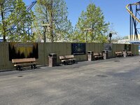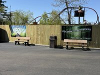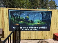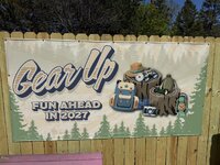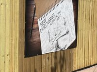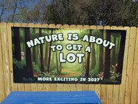

That retro logo is SICK, hope that's what they're going with moving forward.
According to Chicago Coaster Guy, the new kids area is cancelled and not delayed until 2027. The capital that was going to be used for that project is being held for the giga coaster in 2028.Screamscape is reporting that his sources are saying the New Kids' Area is delayed to 2027, but that would be really disappointing for the park's 50th anniversary if true.

well MY sources say that the kids area is cancelled and the attractions that were supposed to be there will be relocated to my backyard for my upcoming amusement parkAccording to Chicago Coaster Guy, the new kids area is cancelled and not delayed until 2027. The capital that was going to be used for that project is being held for the giga coaster in 2028.

Is the name of your amusement park "RetroEscapes"?well MY sources say that the kids area is cancelled and the attractions that were supposed to be there will be relocated to my backyard for my upcoming amusement park
Of course, nobody can visit it
FWIW. I’ve been hearing the sort of the same thing. Except the difference was they were gonna focus on refurbishing the existing two areas and maybe adding like one or two rides. But it feels kind of bizarre to me tbh.According to Chicago Coaster Guy, the new kids area is cancelled and not delayed until 2027. The capital that was going to be used for that project is being held for the giga coaster in 2028.

according to Chicago coaster guy too, the new giga coaster will be named after Taylor swiftAccording to Chicago Coaster Guy, the new kids area is cancelled and not delayed until 2027. The capital that was going to be used for that project is being held for the giga coaster in 2028.

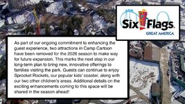
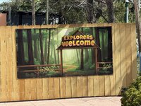
Honestly, I am looking at some of the font being used on these promotions and it is not at all like the camp snoopy font used when promoting the Carowinds expansion, for instance. It just does not give off a Charlie Brown vibe. I would imagine Peanuts would want Six Flags to use branding in a teaser. In fact one of the signs that says, "explorers welcome" has oddly familiar font and coloring reminiscent of the Safari off road adventure at GA. This, along with the mention of trails and wilderness animals seems more like an original theme rather than an IP like camp snoopy. Camp snoopy doesn't actually feature any animals in the lands (with the exception of snoopy and Woodstock). While I would love to see camp snoopy come to Six Flags Great America, I believe Six Flags may be taking another potentially cost cutting measure here adding a kids area with a theme uniquely its own.Definitely a Camp Snoopy, right? The new areas at Knott's and Caro are excellent—would love to see the same ported up to Great America.
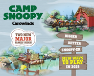
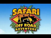
so, a original theme?, like what great escape has?Honestly, I am looking at some of the font being used on these promotions and it is not at all like the camp snoopy font used when promoting the Carowinds expansion, for instance. It just does not give off a Charlie Brown vibe. I would imagine Peanuts would want Six Flags to use branding in a teaser. In fact one of the signs that says, "explorers welcome" has oddly familiar font and coloring reminiscent of the Safari off road adventure at GA. This, along with the mention of trails and wilderness animals seems more like an original theme rather than an IP like camp snoopy. Camp snoopy doesn't actually feature any animals in the lands (with the exception of snoopy and Woodstock). While I would love to see camp snoopy come to Six Flags Great America, I believe Six Flags may be taking another potentially cost cutting measure here adding a kids area with a theme uniquely its own.
View attachment 42321 View attachment 42322
That's what I am thinking. It's just the marketing man in me.so, a original theme?, like what great escape has?
Yeah... perhaps. I just know the teasers for the other Camp Snoopy' s had font and images consistent with the Peanuts. Why would Six Flags opt to take time creating and slapping new AI images to promote Peanuts, when they could just as easily use even less effort by slapping up the same peanuts promos they used at Carowinds?Yeah, I had those thoughts too @SweetBabyJames. Wildcard is that everything they've nailed to the walls looks AI generated so maybe that could explain the stylistic mismatch (read: lack of any style)?
We use essential cookies to make this site work, and optional cookies to enhance your experience.