Register or Login to Hide This Ad for Free!
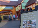
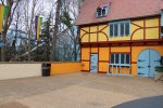
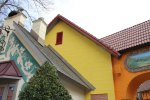
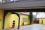
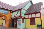
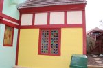
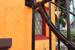
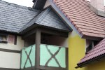
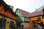
it was so weird walking through rhinefeld for the first time w its new paint yesterday. i hadnt heard anything about it at all, so walking into the area and seeing everything painted puke orange and school bus yellow really threw me off. i literally yelled "WTF IS THAT"
Trying to be positive here, and maybe we should be happy they chose older school bus yellow, and not newer school bus yellow, which has a little bit more green in it? :)

That said, maybe there is something bigger going on here? It seems all the SEAS coaster repaints are moving to bolder/brighter colors, and msybe the plan is to slso paint all areas of the park bolder/brighter? Just throwing it out tuere, and hoping my theory is wrong.
 
That said, maybe there is something bigger going on here? It seems all the SEAS coaster repaints are moving to bolder/brighter colors, and msybe the plan is to slso paint all areas of the park bolder/brighter? Just throwing it out tuere, and hoping my theory is wrong.

I’ve noticed this too. First it was Oktoberfest’s brightly colored buildings, followed by San Marco’s buildings being repainted rainbow in 2016. If you use Google Street View, you’ll notice Killarney also has a much more pastel color scheme today compared to the darker colors it originally had.

Someone at the park or the company must be hellbent on eliminating any beige at the park. I guess it’s too “boring” now? A shame, since the Old Country was built with painstaking attention to detail and accuracy to best transport guests to the areas each village is supposed to represent. As has been an increasing trend at the park in the past decade or so, each hamlet is becoming less and less a representation of their real country and more and more a caricature. Rhinefeld’s storybook yellow buildings perfectly highlight (no pun intended) that trend.
 
The thing I wonder about is if it's wrong to expect a theme park to keep things as they were for decades as if it were a museum?

As has been an increasing trend at the park in the past decade or so, each hamlet is becoming less and less a representation of their real country and more and more a caricature.


For a majority of guests, especially in the next year or so when the paint job is complete and has faded a little bit from UV exposure, will anyone mind the changes?

I think most people would understand that a theme park is in itself a caricature of the land it portrays, whether based on real or fictional locations... So therefore, is there any actual harm in this paint job or are we generally being entitled thoosies who will always try to compare today's operations to the AB years?
 
And just to be clear on my previous statement - I'm not necessarily endorsing the color choices they're using, more commenting on how since it's private property the color scheme of a building is purely at their discretion anyways.

In general, it seems like the goal is to add energy to perceived dead areas of the park - whether it's warranted or not is another discussion.
 
The thing I wonder about is if it's wrong to expect a theme park to keep things as they were for decades as if it were a museum?


For a majority of guests, especially in the next year or so when the paint job is complete and has faded a little bit from UV exposure, will anyone mind the changes?

I think most people would understand that a theme park is in itself a caricature of the land it portrays, whether based on real or fictional locations... So therefore, is there any actual harm in this paint job or are we generally being entitled thoosies who will always try to compare today's operations to the AB years?

I get what you're saying, but I disagree with this take. I agree that BGW, and any other theme park, isn't a museum and that change is natural and necessary over time. I'm in no way against change.

That said, what put BGW on the map in the first place is the attention to detail with which it was designed to be accurate to the cultures it represents. BGW is special precisely because it wasn't designed with the attitude that "a majority of guests" won't "mind." It's the little details and that attention to being accurate that make BGW immersive, that allow you to pretend you're really in a sleepy Scottish hamlet or a little German village.

Change as a whole is fine, but I think the saying "If it ain't broke, don't fix it" applies here. Was anyone who visited the park actually pressed by Rhinefeld's white and beige walls? As @Zachary has said, Rhinefeld was probably the park's least broken, most thematically intact area. It was one of the park's few areas that truly continued to create that sense of authentic immersion and escape with which it was designed. The question isn't just whether or not the yellow is okay; the question is why they felt the original color even needed to be changed in the first place. Why wasn't this budget allocated to poor Pompeii's horribly faded facades? To repainting the decrepitly weathered gift shop in Festa that @Mwe BGW pointed out the other day? Why "fix" what "ain't broke"?

So therefore, is there any actual harm in this paint job or are we generally being entitled thoosies who will always try to compare today's operations to the AB years?

Singling out this statement because I strongly disagree with this last point. Nobody should disagree that our expectations for BGW should be different from AB-era BGW operationally, but this isn't an operational change. It's reasonable to understand that today's publicly-traded corporate-owned BGW is going to do more to cut costs and maximize profits than in the old days, with less focus on those attention to details. But the thing is, this repainting isn't an example of neglect or corporate cost-cutting. In fact, BGW is going out of their way to invest in this project that presumably doesn't even need to be happening in the first place. The frustration about this project has nothing to do with unrealistic expectations for a post-AB BGW. The frustration is this change is a deliberate, needless replacement. It has nothing to do with tighter budgets or shareholder expectations; it's just purely an example, in my opinion, of poor judgment by the park.
 
Why wasn't this budget allocated to poor Pompeii's horribly faded facades? To repainting the decrepitly weathered gift shop in Festa that @Mwe BGW pointed out the other day? Why "fix" what "ain't broke"?
Also, they could repaint the storks on the roofs, Repaint the murals and french advertisements in Aquitaine, (some of them on the skyride side are faded beyond recognition) Bring back alpie's roof theming, Repaint the mural over Das Edelweiss, Repaint the wilkomenhaus mural, Get rid of the ugly green wood on the upgrade center, Repaint Der Marktplatz murals, Repaint the murals on Der Autobahn, fix all the rotting wood all over the park, And so on. It really hurts to see a park that was so great turn into this.
 
Still prefer the original color, but I like that way more than the yellow. This definitely confirms my suspicion that they’re trying to give Rhinefeld the same multicolored treatment they gave San Marco in 2016.
 
Key lime does not really feel right though, even if they managed to find one picture of one building that surely has most definitely also been key lime for 100s of years. At least maintenance is occurring.
 
  • Like
Reactions: Coasternerd
Is Scott back or something?
guess GIF
 
I liked how proper and simple Rhinefeld looked. That said, I don't really think this looks terrible, and will only look better and better as this process goes on and the paint fades season by season. I'd say for the look they are going for, they are doing it well. Me personally, I prefer the old look as a concept, but maybe that is the nostalgia side of me talking.
 
Rhinefeld paint update 2/26/21
 

Attachments

  • BFDBA875-2650-467A-83DC-C5C49EB88767.jpeg
    BFDBA875-2650-467A-83DC-C5C49EB88767.jpeg
    10.8 MB · Views: 81
  • F66950EE-A249-47EE-B1ED-F57EDA3250E1.jpeg
    F66950EE-A249-47EE-B1ED-F57EDA3250E1.jpeg
    8 MB · Views: 69
  • A56F1CB2-5950-426E-B29D-1C9ED2BA2AA9.jpeg
    A56F1CB2-5950-426E-B29D-1C9ED2BA2AA9.jpeg
    6.3 MB · Views: 67
  • 0BC1D8C7-9594-4558-A1BE-AB937078E231.jpeg
    0BC1D8C7-9594-4558-A1BE-AB937078E231.jpeg
    8.5 MB · Views: 66
  • 7F946AE0-7304-43E3-9F3A-EA2E08913549.jpeg
    7F946AE0-7304-43E3-9F3A-EA2E08913549.jpeg
    7.7 MB · Views: 65
  • B8C1F272-55E1-4812-820E-EEA0E19354B4.jpeg
    B8C1F272-55E1-4812-820E-EEA0E19354B4.jpeg
    6.5 MB · Views: 67
  • 7735607A-EC75-4318-B2BA-97DB420DF3EF.jpeg
    7735607A-EC75-4318-B2BA-97DB420DF3EF.jpeg
    6.7 MB · Views: 61
  • ADC9031B-E492-420C-B4E5-52B508242717.jpeg
    ADC9031B-E492-420C-B4E5-52B508242717.jpeg
    7.1 MB · Views: 77
Consider Donating to Hide This Ad