
Are they trying to lose the lower level most beautiful theme park award to?
Rhinefeld (Germany)
- Thread starter Zachary
- Start date
You are using an out of date browser. It may not display this or other websites correctly.
You should upgrade or use an alternative browser.
You should upgrade or use an alternative browser.
Register or Login to Hide This Ad for Free!

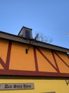
The pig sign that hung about the Das Stein Haus sign is finally gone, It was faded beyond recognition.From a post in the insiders group. Looks like there may be hope for the mural after all.
This might legitimately be one of the stupidest things BGW has ever done. At least paint can be redone though…
My ONLY solace is that when San Marco’s buildings were painted rainbow colors in 2016, the murals eventually did return later that season. Of course, 2016 BGW and 2022 BGW are parks with very different management philosophies.
My ONLY solace is that when San Marco’s buildings were painted rainbow colors in 2016, the murals eventually did return later that season. Of course, 2016 BGW and 2022 BGW are parks with very different management philosophies.
From a post in the insiders group. Looks like there may be hope for the mural after all.
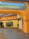
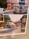
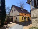
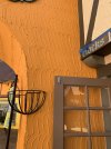
I seriously can't believe that there's a building in Rhinefeld right now that's school bus yellow.
I seriously can't believe that there's a building in Rhinefeld right now that's school bus yellow.
According to https://lib.vt.edu/brand/color.html
That color is "Triumphant Yellow"
Now that I understand what they're trying to do with the new colors I don't mind it as much. I mean in their defense, the buildings in Das Festhaus have been painted that way forever to my knowledge.


Last edited:
Yeah I genuinely think it doesn’t look that bad. I can see what they’re going for and I feel like the finished product will be more digestibleHonestly, I think it looks nice and I like it. It reminds me of some villages that I visited in Germany when I went on a trip there.
Now that I understand what they're trying to do with the new colors I don't mind it as much. I mean in their defense, the buildings in Das Festhaus haven't painted that way forever to my knowledge. View attachment 25888
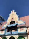
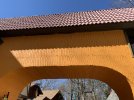
Conceptually, I have no problem with trying to liven up Rhinefeld a bit with some color. German towns today do often utilize some bright colors.
THAT SAID, there's something actual German towns and even the fake buildings in Das Festhaus have that Rhinefeld's buildings don't: detail. In the photo above and in so many of the authentic German reference photos I've been digging through this evening, brightly colored buildings are almost always visually broken up by greenery, flower boxes, murals, trim, elaborate woodwork, other buildings with much more muted colors, and even the dark gray streets over which they tower. Bright colors work in authentic German towns because they don't overwhelm the eye—there are plenty of darker, less vibrate, visual elements in the foreground to tone down colors that, in isolation, are quite bold.
Another thing these real German towns have is scale. Because guests are constantly so close to the buildings in Rhinefeld, a single structure almost always fills a guest's entire field of view. That, alone, is a very good reason to use a toned-down color scheme. Just because the exact color being used is identical to the real thing doesn't mean that it's portraying an accurate representation of the real thing to guests.
Similarly, another result of Rhinefeld's size is that its narrow walkways and streets frequently run flush against building walls. While in authentic German towns, there's frequently a stone base on the buildings or similar to divide streets from building walls, there's no such visual divide in Rhinefeld. Now, by itself, this may sounds like a minor deal, but there's a compounding factor at work here too: Rhinefeld, like most of the rest of BGW, uses a yellow/orange-hue aggregate whereas the authentic German villages BGW is referencing typically use gray stone. Because Rhinefeld paths already fill a guest's eye with so much yellow/orange, utilizing more yellow/orange in the buildings that interface directly with the pathway makes the same yellow or orange in Rhinefeld look far more garish than that yellow or orange would look against a gray cobblestone path in Germany proper.
I have more—a lot more probably—but you get my point. Building a theme park representation of something is rarely just a matter of taking the real thing and shrinking it down. Scale, setting, perspective, etc all have a direct and measurable impact on perception. BGW's original buildout was painstakingly designed to capture the essence of the Old Country it was built to reflect. To see BGW decide that Rhinefeld—one of the best preserved, most treasured parts of that initial buildout—needs to just become yet another colorful crayon box is just so goddamn frustrating. So many aspects of BGW desperately need thematic investment right now and to see the money go here—to defacing one of the least broken, most effectively immersive and transportive, themed areas of Busch Gardens Williamsburg—I'm just utterly dumbfounded and completely disheartened.
Last edited:
Now that I've sat on it a little, I like the concept. Looking at the sign they posted I really like the blue/green paint concepts that were posted.
But bright orange doesn't fit at all. It's pretty jarring.
But bright orange doesn't fit at all. It's pretty jarring.
“My son you were never sane to begin with!”Who says they were in "the right mind" in the first place?
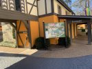
Now there is one thing to think about here, that I don’t believe anyone else has brought up- with DarKoaster being a project coming out in 2023 (hopefully)- what are the chances that they could instead be trying to liven up the area in preparation for darkoaster opening? We saw this with Oktoberfest when Mach and bolt were added- prior to that they got an extensive refurbishment. If this is the case- it does make some sense. A lot of people don’t really go to rhinefeld for rides- they’re there because its a way to get from point a to point b. However- by livening up the area prior to a new attraction opening- it does make sense, because hopefully the bright colors would draw people in and hopefully get that area some much needed business. Particularly the area that Das Edelweiss occupies- it’s pretty much event only area. Same deal for the place that’s underneath the glockenspiel. I won’t be surprised if we see the carousel get some new paint as well.
Just my take- but until I see the finished product- I will stand by my opinion of “what the actual hell is this?”
Just my take- but until I see the finished product- I will stand by my opinion of “what the actual hell is this?”
Three things have occurred to me concerning this new paint job.
1. I wonder if they are planning to paint any other areas of the park and do a color change in the process?
2. During HOS they could have a couple of scare actors dress up as big pumpkins and have then standup against the walls where they would blend right in and you'd never see them until they jumped out at you to scare the day lights out of you.
3. Seeing that last year during CT they changed the colors of this hamlet to the candy cane red and white I wonder if they won't have to change it again this year as I'm not sure that color scheme would look that good with this new paint.
Conceptually, I have no problem with trying to liven up Rhinefeld a bit with some color. German towns today do often utilize some bright colors.
THAT SAID, there's something actual German towns and even the fake buildings in Das Festhaus have that Rhinefeld's buildings don't: detail. In the photo above and in so many of the authentic German reference photos I've been digging through this evening, brightly colored buildings are almost always visually broken up by greenery, flower boxes, murals, trim, elaborate woodwork, other buildings with much more muted colors, and even the dark gray streets over which they tower. Bright colors work in authentic German towns because they don't overwhelm the eye—there are plenty of darker, less vibrate, visual elements in the foreground to tone down colors that, in isolation, are quite bold.
They are clearly not finished with painting and the work. I would expect that there are a bunch more things added to the overall design. All we are seeing is the first phase of painting. I think it's premature to say that this won't look good when it's finished. We are seeing a work in progress. This is a project that in years past we wouldn't have known it was happening until it was finished and we came to the park.
The concept art, and some of the work.Im in the park now, about to go to rhinefeld.
Attachments
-
 9FF0EB92-2A9F-4ADD-BCF7-18932E577389.jpeg2 MB · Views: 104
 -
 7711BF45-635E-48C7-B038-93AADCE9DAEC.jpeg2.2 MB · Views: 99
 -
 38D3B40C-DA9F-4155-A35E-FDC6ED091AE6.jpeg2 MB · Views: 94
 -
 0AA86EA4-8ED3-417E-AC99-56BF57787768.jpeg2.3 MB · Views: 95
 -
 C82E30BB-6A5F-4F53-9355-E3657654695B.jpeg4.1 MB · Views: 93
 -
 5E129671-BEE6-437E-80A6-2CDC0614DBEC.jpeg3.9 MB · Views: 91
 -
 C896E032-8872-4373-A249-66338D36FE24.jpeg1.7 MB · Views: 85
 -
 C9517F95-4653-4CB8-8771-8F01D2BED900.jpeg1.7 MB · Views: 85
 -
 62D73F56-91B8-4D43-BE03-9C70C009ACB4.jpeg4 MB · Views: 85
 -
 ED5C8E7A-CD7C-4C11-90F2-EEC66AEBECC9.jpeg1 MB · Views: 82
 -
 061A0EFF-E04C-4146-809E-E7B7183AFE8F.jpeg2.5 MB · Views: 103
I want to go on record as saying that I honestly think the concept art looks really good. That said, from what I can tell, the colors that have actually been painted on buildings so far are notably more saturated than the concept art shows. Maybe they are going to tone things down with a subsequent coat or something?
I'm all for withholding final judgement until it's done—but the first impressions haven't been good.
I'm all for withholding final judgement until it's done—but the first impressions haven't been good.
Last edited:
Not saying a Six Flags merger will happen. Rather, I meant this from the obnoxious color perspective, which permeates Six Flags parks.One step closer to merging with Six Flags?
it was so weird walking through rhinefeld for the first time w its new paint yesterday. i hadnt heard anything about it at all, so walking into the area and seeing everything painted puke orange and school bus yellow really threw me off. i literally yelled "WTF IS THAT"
Share:
Consider Donating to Hide This Ad