I think it looks alright, actually.
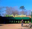
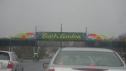
It sort of changes the expectations, right? I mean, if we go back to theme park theory, we look at the park as a living scene from a film or show, and the entry signage represents the opening title cards. These titles definitely give a different impression of what is ahead for guests. I think they draw out the contemporary "fun gardens" aspect, rather than the Old Europe aspect. Part of me doesn't like that, but part of me thinks that is okay, really, because the scenery can still be old Europe, even if the park itself chooses to emphasize the environmental aspects.
Really, though, they probably just did market research and found that regular park goers like the animals a lot...so somebody thought that meant "go green. They like green."
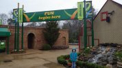
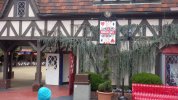
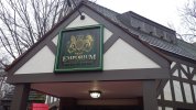
It follows suit, in any event. Aquataine is France.
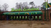
It sort of changes the expectations, right? I mean, if we go back to theme park theory, we look at the park as a living scene from a film or show, and the entry signage represents the opening title cards. These titles definitely give a different impression of what is ahead for guests. I think they draw out the contemporary "fun gardens" aspect, rather than the Old Europe aspect. Part of me doesn't like that, but part of me thinks that is okay, really, because the scenery can still be old Europe, even if the park itself chooses to emphasize the environmental aspects.
Really, though, they probably just did market research and found that regular park goers like the animals a lot...so somebody thought that meant "go green. They like green."
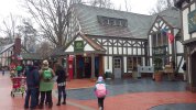
It follows suit, in any event. Aquataine is France.