
Banbury Cross Retheme Coming in 2014
- Thread starter Zachary
- Start date
You are using an out of date browser. It may not display this or other websites correctly.
You should upgrade or use an alternative browser.
You should upgrade or use an alternative browser.
Register or Login to Hide This Ad for Free!

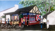


I thought this was a drawing of Chickenking's concept of themeing for London Rocks.


Mazakman said:I wonder if the lady in the black dress is hot...
I was going to say she was a but-her-face but there are no faces so I say Yes, hot.


- Feb 17, 2014
- 619
- 448
- 160
I don't to be honest. Even though it's just concept art, I think it is waaaayyyy to gaudy. Yellow, red, blue, and white? No way.
'Course, I'm sure that's the point.
'Course, I'm sure that's the point.

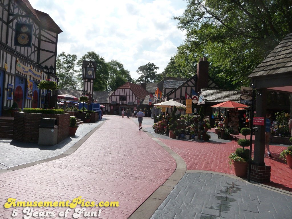
So I know this is an older picture, but imagine the image Zachary posted in this picture to the right, where the flags are where the Cotton Candy Stand is pictured. The front of the Cotton Candy Stand has a Blue colored sign in the peak of the front of the roof. I picked this image because the angles are approximate to the illustration image posted. I looked for a better shot of the area but this was one of the better ones I found doing a quick search. Really not holding out A lot of hope for this now. It will clash somewhat in my opinion.
Just my thoughts.
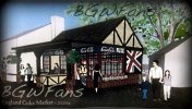
I like the design but I wish the colors were bit more muted and not so literal to the British Flag. Make them more rich and deeper in color. I did some tweaking in Photoshop on the colors- maybe like this?
Sometimes a bit more subtlety goes a long way.
Sometimes a bit more subtlety goes a long way.
Attachments
MrLaptop said:I don't to be honest. Even though it's just concept art, I think it is waaaayyyy to gaudy. Yellow, red, blue, and white? No way.
'Course, I'm sure that's the point.
I honestly don't see it as gaudy and I can't think of why you would use that word, other than certain feelings towards certain people or really one person.
I think it will blend in well with the surrounding buildings and architecture. The actual building itself will have red brick, and the tan and brown look that all the other buildings have. The only think that remotely ruins that look is the Union Jack and Coca-Cola line; which, I do not expect to be exact to the image posted. I actually expect those to fit in better.
Here is a more accurate angle that closely matches the concept image I found using Google Maps Street View
https://www.google.com/maps/@37.236217,-76.646148,3a,75y,166.4h,77.63t/data=!3m5!1e1!3m3!1sF1-NJ6GSmAlROrV8Qr_0Cw!2e0!3e5

Party Rocker said:I honestly don't see it as gaudy and I can't think of why you would use that word, other than certain feelings towards certain people or really one person.
massive-facepalm.jpg
I think it will blend in well with the surrounding buildings and architecture. The actual building itself will have red brick, and the tan and brown look that all the other buildings have. The only think that remotely ruins that look is the Union Jack and Coca-Cola line; which, I do not expect to be exact to the image posted. I actually expect those to fit in better.
The building itself looks quite nice. The architecture fits the original theme well, and the actual structure looks no different from the surrounding area. What gets me is the red-colored windows and the flashy, advertisement-like Coca-Cola signage. I think "tacky" sums that up pretty well. The red windows too are a little odd with the old-world architecture. It's almost as if whoever designed the building couldn't make up their mind as to whether the building should be Banbury Cross-themed or London themed.

Joe said:The building itself looks quite nice. The architecture fits the original theme well, and the actual structure looks no different from the surrounding area. What gets me is the red-colored windows and the flashy, advertisement-like Coca-Cola signage. I think "tacky" sums that up pretty well. The red windows too are a little odd with the old-world architecture. It's almost as if whoever designed the building couldn't make up their mind as to whether the building should be Banbury Cross-themed or London themed.
I guess you can blame that on just how last minute and rushed this project was. The concept art shows that it was just essentially "can't make a decision? Wing it!" with the lack of budget this entire Branbury Cross rethemeing project had.
- Feb 17, 2014
- 619
- 448
- 160
Okay, I must ask, is this concept art going to happen? You guys are making it sound like it is.
I have a feeling most of what we see will be familiar, but things like the red window frames will not come to fruition.
Joe, I agree that the Coca-Cola banner is somewhat tacky, but I feel that is one of the things that will not come out exactly as it appears in the concept art.
Joe, I agree that the Coca-Cola banner is somewhat tacky, but I feel that is one of the things that will not come out exactly as it appears in the concept art.
If that's what you're going by, what's to say that they won't go the other direction and make things tackier?
Share:
Consider Donating to Hide This Ad