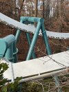
To my eye, the green support structure was the best the park could do to visually atone for the actual greenery removed to install Alpengeist. That little valley was so bare during those first several years after construction. Any medium-green presence in the area gave at least some sort of organic touch, albeit not much of one.
Now that that area has grown in, and given that the ride's theme remains that of a mountain-dwelling snow beast, I am a fan of the idea of keeping the green color or maybe even darkening it just a bit, to keep the look of the entire ride as consistent as possible with its surrounding greenery and mountain theme -- and to avoid increasingly odd color clashes between vegetation and steel. It isn't clear to me what purpose a light blue support structure serves to the visual appeal or (less importantly, let's be honest) thematic presence of the ride. Really, though, I just don't want it to look bad.
Maybe someone in the decision maker's chair got it into their head that the green is 90s-awful, and a lighter visual presence would be better once repainting was necessary. Maybe the entire ride is supposed to look like ice now. Maybe the light blue paint is cheaper. Whatever the reason, it appears that this ship has already sailed, so oh well. Time will tell what the valley area looks like with rather vivid light blue supports everywhere.
I am reminded of one ostensible motivation I heard for Griffon's color scheme, that being to limit the color clash between the ride and the sky, given that Griffon is visible from outside the park and therefore subject to line-of-sight complaints. I am of the opinion that the color scheme doesn't matter that much when you are viewing a large steel structure from the ground more than about 2,500 feet away, as long as the structure isn't day-glo orange etc., because the color tends to wash out visually at that distance anyway, and there is really no such thing as "blending in." But that's just my take. Perhaps the blue color scheme was part of the process to get approval for Griffon in the first place. As Alpengeist is quite visible from several specific regions of the park's surrounding area -- third overall IMO only to Mach Tower and of course Griffon, both of which are entirely blue save for caps and vehicles -- is there any chance that the light blue color choice for Alpengeist is tied to some pledge that the park will only paint highly visible structures in sky-like colors?
(Anticipating the obvious: Yes, Apollo and Tempesto are extremely visible from certain areas outside the park's hamlets, most notably parking lots, a road or two, and that hotel I've never stayed at. But these two rides are not very visible at all from the residential areas that seem to drive the most vocal complaints.)





 They always fix the shit that isn't broken, and ignore the stuff that is....