
Site Updates & Changes
- Thread starter Gavin
- Start date
You are using an out of date browser. It may not display this or other websites correctly.
You should upgrade or use an alternative browser.
You should upgrade or use an alternative browser.
Register or Login to Hide This Ad for Free!
RE: The ParkFans Network: Site Updates & Changes
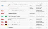
OK! I said we might have version 3.0 before the night is up and here it is:

As you can see, each covered park has its own icon seperate from the hamlet flags and there is a lock on closed topics. The lock is something we've been trying to figure out since we left the BGWFans Classic theme a long time ago, but its fixed now! If the forum doesn't look like this screen shot on your computer please clear your browsers cache.
Many thanks go to Zachary for getting this to work, its something we've been trying to get working for 6-8 months now!
OK! I said we might have version 3.0 before the night is up and here it is:
As you can see, each covered park has its own icon seperate from the hamlet flags and there is a lock on closed topics. The lock is something we've been trying to figure out since we left the BGWFans Classic theme a long time ago, but its fixed now! If the forum doesn't look like this screen shot on your computer please clear your browsers cache.
Many thanks go to Zachary for getting this to work, its something we've been trying to get working for 6-8 months now!
Attachments
RE: The ParkFans Network: Site Updates & Changes
They were very convenient!
Nevermind. This solution works too.
Carry on with your improvements...
Zachary said:*groan*
Are they needed?
They were very convenient!
Zachary said:Clicking the green arrow will take you to the first unread post and hitting "Last Post" will take you to the newest post in the thread.
Nevermind. This solution works too.
Carry on with your improvements...
RE: The ParkFans Network: Site Updates & Changes
I like the maroon for BGW, I really don't like that slime green. And they are very useful, because sometimes I really don't know which park a thread belongs to sometimes. Overall, very nice.
I like the maroon for BGW, I really don't like that slime green. And they are very useful, because sometimes I really don't know which park a thread belongs to sometimes. Overall, very nice.
RE: The ParkFans Network: Site Updates & Changes
If you are addressing me, yes, I agree. I like the little green arrow better. (See my follow-up post above.)
????
It is a nice green!
If you are addressing me, yes, I agree. I like the little green arrow better. (See my follow-up post above.)
JuniorBGWfan28 said:I like the maroon for BGW, I really don't like that slime green. And they are very useful, because sometimes I really don't know which park a thread belongs to sometimes. Overall, very nice.
????
It is a nice green!
RE: The ParkFans Network: Site Updates & Changes
For the record, please don't shy away from telling us you all don't like a change or miss a bit of functionality- to be honest, I don't know how most people navigate the forum- the only way I know if people use something is if I remove it and see if people notice/get angry about it. It really does help.
For the record, please don't shy away from telling us you all don't like a change or miss a bit of functionality- to be honest, I don't know how most people navigate the forum- the only way I know if people use something is if I remove it and see if people notice/get angry about it. It really does help.
RE: The ParkFans Network: Site Updates & Changes
Zach feeds off of your anger, everyone. Your hatred makes him strong.
Zach feeds off of your anger, everyone. Your hatred makes him strong.
RE: The ParkFans Network: Site Updates & Changes
I made the icons out of the "New" Busch Gardens logo and stole the "W" from WaterCountry USA's new logo. The "T" for Tampa was a creative combination of a couple of letters I stole from both WCUSA's logo and Adventure Island's. KD is also the same font used by Cedar Fair for all their properties.
We went with the same color we use across all of our BGW related sites for the icon for BGW (Forum, FB, Twitter, Blog, etc) and the green for BGT is the same minty green we use on all of BGTFans.
Thanks, that was the main goal. We have been trying to find a way to separate each parks' unread posts entirly and had even contacted a developer to fix the issue but were never able to satisfactorily come to an effective solution. Oddly Zach and I both tackled this issue at the same time without one another knowing. I put out "Version 1.0" and he was already working on his own solution "Version 2.0" and we decided to merge the two ideas together and thats what we have now.
I made the icons out of the "New" Busch Gardens logo and stole the "W" from WaterCountry USA's new logo. The "T" for Tampa was a creative combination of a couple of letters I stole from both WCUSA's logo and Adventure Island's. KD is also the same font used by Cedar Fair for all their properties.
JuniorBGWfan28 said:I like the maroon for BGW, I really don't like that slime green.
We went with the same color we use across all of our BGW related sites for the icon for BGW (Forum, FB, Twitter, Blog, etc) and the green for BGT is the same minty green we use on all of BGTFans.
I think he might be referring to the official shade(s) of green that the company uses in the official logo, not our minty green color for BGTFans. Though you could also be talking about the official green color and I'm the only person that thinks this conversation has anything to do with out BGTFans color.Nic said:????
It is a nice green!
JuniorBGWfan28 said:[The icons] are very useful, because sometimes I really don't know which park a thread belongs to sometimes. Overall, very nice.
Thanks, that was the main goal. We have been trying to find a way to separate each parks' unread posts entirly and had even contacted a developer to fix the issue but were never able to satisfactorily come to an effective solution. Oddly Zach and I both tackled this issue at the same time without one another knowing. I put out "Version 1.0" and he was already working on his own solution "Version 2.0" and we decided to merge the two ideas together and thats what we have now.
RE: The ParkFans Network: Site Updates & Changes
The Forum Games board has been removed. Shane and I have always hated them because it promotes frivolous impulse-posting but today we decided to run the idea of removing them by some influential members of the community and the response we received was basically unanimous. Basically everyone we asked either didn't care about them at all or greatly disliked them. Hence, they've been removed.
The Forum Games board has been removed. Shane and I have always hated them because it promotes frivolous impulse-posting but today we decided to run the idea of removing them by some influential members of the community and the response we received was basically unanimous. Basically everyone we asked either didn't care about them at all or greatly disliked them. Hence, they've been removed.
RE: The ParkFans Network: Site Updates & Changes

RE: The ParkFans Network: Site Updates & Changes
BGWFans' Christmas logos have gone live across all of its social media accounts, the forum, and the blog. BGTFans will be gettings its never before seen Christmas Town logo soon as well.
BGWFans' Christmas logos have gone live across all of its social media accounts, the forum, and the blog. BGTFans will be gettings its never before seen Christmas Town logo soon as well.
RE: The ParkFans Network: Site Updates & Changes
The new BGTFans Christmas logo is now live.
The new BGTFans Christmas logo is now live.
RE: The ParkFans Network: Site Updates & Changes
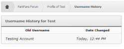
The staff has decided to modify the user control panel a bit to limit the number of times a user can change their username. Whether you used it or not the forum has allowed users to change their username at will. As the site has grown and we've gained more users and its hard to tell who someone was or is if they have changed their user name. While we don't mind if you decide to change your name from FlatRideFreak to Jim or what ever else you want we want to curb the frequent change of username that occurs on a monthly/seasonal basis. Going forward users will be allowed to change their username two times in a 90 period, mainly in case you misspelled it or something. Additionally all username changes have to be approved by a member of the site staff.
It looks like this:
Attachments

RE: The ParkFans Network: Site Updates & Changes
This has to be one of my favorite changes made to the site in a long time. It drives me crazy trying to figure out who the heck that person who just posted is, and who they used to be. The fact that you can see previous usernames is a definite plus! This seems like the perfect fix to the problem, with just enough leeway to keep things fresh here and there without getting distracting. This is especially good with all these new people joining the imaginary "First Name Club" which Zachary mentioned to me in a PM once and I sort of~kind of spilled to everyone else.
Good job! Every change made to this site has just made it even more professional, welcoming, and user-friendly. Keep it up!
Share:
Consider Donating to Hide This Ad