

News Cedar Fair Merges with Six Flags
- Thread starter horsesboy
- Start date
You are using an out of date browser. It may not display this or other websites correctly.
You should upgrade or use an alternative browser.
You should upgrade or use an alternative browser.
Register or Login to Hide This Ad for Free!

Right under the pass number when I open the app. Even funnier when you consider it's already over a decade old.The fact that’s even there is hilarious

I am hoping that now the merger is complete we hear something about passes soon. They may end up just honoring them for the rest of the year like they’ve done for past acquisitions, and that makes sense as a goodwill measure and a revenue/attendance boost they could use. Your wish may come true in the short term.Dear Six Flags' new management. I am writing to inform you that as a consumer my Six Flag Gold Plus pass lists it's self as valid for admission at any Six Flags park for another 76 years. I fully expect you to continue to honor this expiration date at it's listed $5.99 a month price

It's final
Cedar Fair and Six Flags Merger of Equals Successfully Completed, Creating a Leading Amusement Park Operator
New investor site: https://investors.sixflags.com/
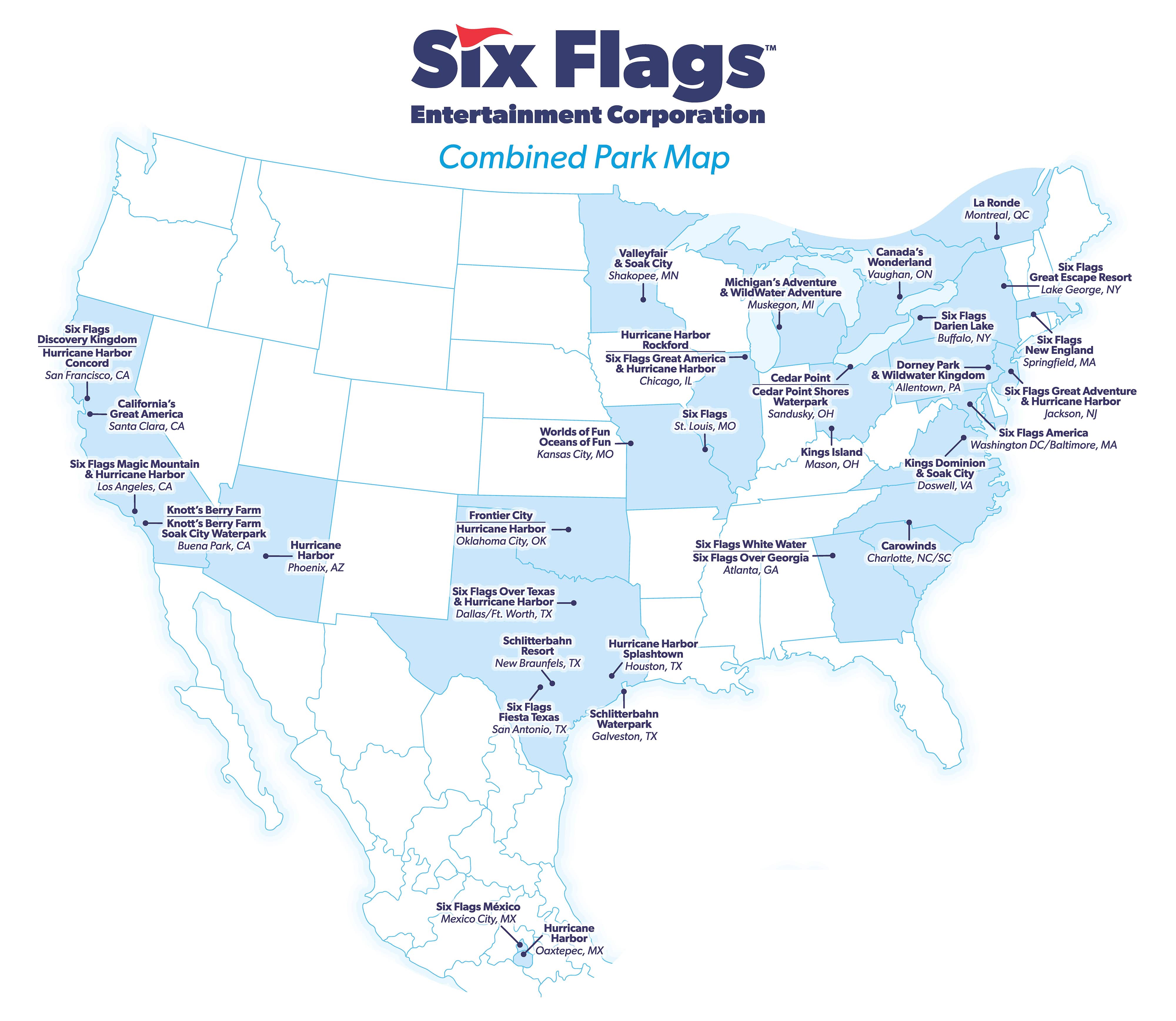
Official parks map (note the new corporate logo as well):

Cedar Fair and Six Flags Merger of Equals Successfully Completed, Creating a Leading Amusement Park Operator
New investor site: https://investors.sixflags.com/
Official parks map (note the new corporate logo as well):
Last edited:


I know Six Flags is a better known brand, but this is one of those cases where the more highly regarded brand should have won out, with Six Flags maybe kept as a sub-brand to CF.
Just remember folks this is a merger of the maintenance supervision that gave us El Toro version 1, 2, 3 and the maintenance supervision that gave us Top trill dragster, Fury. What could possibly go wrong.


And so it’s begun….
(Can we put Snoopy in a Batman costume?)

I wonder how the individual logos for the Six Flags parks are going to change.

How dare you make me excited for this merger(Can we put Snoopy in a Batman costume?)
Official parks map (note the new corporate logo as well):
SFNE and SFA being in the same state is quite something. Did Massachusetts and Maryland merge as well?

I do think the CF font/styling in the SF brand looks really look. Im excited to see the new corporate identity.It's final
Cedar Fair and Six Flags Merger of Equals Successfully Completed, Creating a Leading Amusement Park Operator
New investor site: https://investors.sixflags.com/
Official parks map (note the new corporate logo as well):
Lord please find a way to extended Six Flags hours for the rest of the summer
Last edited by a moderator:

As hard as it is to see the Six Flags name over the Cedar Fair parks, I’m really glad they changed the logo. That was one of my biggest hopes for something we’d see out of the merger in the short term. The old logo felt super tacky and cheap to me. I was dreading seeing that logo plastered all over shopping bags and paper cups at KD. The new logo, while it won’t win any awards for originality, at least feels a bit more refined.
And if you stack the Six and Flags it will look good for an App Icon when they merge the apps.As hard as it is to see the Six Flags name over the Cedar Fair parks, I’m really glad they changed the logo. That was one of my biggest hopes for something we’d see out of the merger in the short term. The old logo felt super tacky and cheap to me. I was dreading seeing that logo plastered all over shopping bags and paper cups at KD. The new logo, while it won’t win any awards for originality, at least feels a bit more refined.

I actually liked the previous Six Flags logo, taken outside of its context and associations with the downmarket branding of Six Flags of course.As hard as it is to see the Six Flags name over the Cedar Fair parks, I’m really glad they changed the logo. That was one of my biggest hopes for something we’d see out of the merger in the short term. The old logo felt super tacky and cheap to me. I was dreading seeing that logo plastered all over shopping bags and paper cups at KD. The new logo, while it won’t win any awards for originality, at least feels a bit more refined.
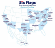
They fixed the map graphic! Either that, or the FTC decided to step in and block the Massachusetts/Maryland merger.
I actually liked the old Six Flags logo a lot... but I can't think of any possible way to incorporate Cedar Fair into it. This was a pretty good way to go about things and I'm sure I'll get used to it.
It's interesting that they still left Six Flags St. Louis as just "Six Flags" when making revisions.
I don't think that new logo should be considered permanent, more a stopgap measure that unifies the brand at the corporate level but nothing more.As hard as it is to see the Six Flags name over the Cedar Fair parks, I’m really glad they changed the logo. That was one of my biggest hopes for something we’d see out of the merger in the short term. The old logo felt super tacky and cheap to me. I was dreading seeing that logo plastered all over shopping bags and paper cups at KD. The new logo, while it won’t win any awards for originality, at least feels a bit more refined.
The merger being "completed" really means it's just beginning.
I think the members of this board know full well that which of the two companies is now more in control. Fears about the Six Flags brand seeping into your legacy CF parks, like KD, and bringing them down to the former Six Flags' quality, are unwarranted.
There are more Six Flags alumni on the Executive Team than there are Cedar Fair alumni.
It's more interesting to see who's from the former Paramount Parks than anything else.
Also Richard Zimmerman has been (not sure if he still is) working out of an office at KD since 2018 when he became CEO.
It's more interesting to see who's from the former Paramount Parks than anything else.
Also Richard Zimmerman has been (not sure if he still is) working out of an office at KD since 2018 when he became CEO.
Share:
Consider Donating to Hide This Ad