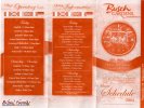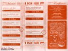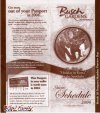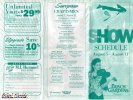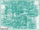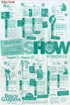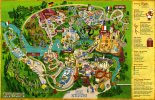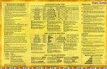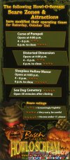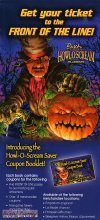

I actually think the bright orange and blue clashes with the dullness of the actual map a bit.
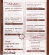
I liked the burgundy-white because it went better with the dark green grass and brown tops of the map. Plus, after a while, it almost started to look like an ancient map if you had it folded in your pocket for awhile. This one looks just looks like crumpled up paper. But who am I kidding, I'm talking about the colors on the side of the map.
If they made it a little more cartoonish it might look better, in my opinion.
I liked the burgundy-white because it went better with the dark green grass and brown tops of the map. Plus, after a while, it almost started to look like an ancient map if you had it folded in your pocket for awhile. This one looks just looks like crumpled up paper. But who am I kidding, I'm talking about the colors on the side of the map.
If they made it a little more cartoonish it might look better, in my opinion.