Attraction Wildcat's Revenge
- Thread starter warfelg
- Start date
You are using an out of date browser. It may not display this or other websites correctly.
You should upgrade or use an alternative browser.
You should upgrade or use an alternative browser.
Register or Login to Hide This Ad for Free!
Direct Link to Embedded Media Source
Usually I like seeing track used as props (Ex: Hulk), but... this looks weird in my opinion.
Direct Link to Embedded Media Source
Usually I like seeing track used as props (Ex: Hulk), but... this looks weird in my opinion.
Agreed, this looks dumb as hell
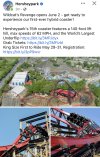
And here’s all my Hershey friends praising it for being well themed.I don't understand the aesthetic vision for this attraction at all. The coaster looks absolutely incredible, but everything they've installed around it and designed for it is just hideous.
I think the biggest problem is the lack of cohesion. It feels like every single visual element of the ride was designed completely independently of the others. The logo looks sick, but it gives off a completely different vibe than the realistic look that they went for on the trains, which in my opinion look pretty bad.I don't understand the aesthetic vision for this attraction at all. The coaster looks absolutely incredible, but everything they've installed around it and designed for it is just hideous.
Even worse, the station design looks tacky (although I can see what they were going for) and putting the maintenance tracks in a giant black box just looks tacky and cheap. It’s like they couldn’t decide whether to go with the “nod to its predecessor” route or take it in a new creative direction, and the end result is a product that looks tacky and out of place, which is absolutely wild for what’s essentially a redo of an existing ride
I think the biggest problem is the lack of cohesion. It feels like every single visual element of the ride was designed completely independently of the others. The logo looks sick, but it gives off a completely different vibe than the realistic look that they went for on the trains, which in my opinion look pretty bad.
Even worse, the station design looks tacky (although I can see what they were going for) and putting the maintenance tracks in a giant black box just looks tacky and cheap. It’s like they couldn’t decide whether to go with the “nod to its predecessor” route or take it in a new creative direction, and the end result is a product that looks tacky and out of place, which is absolutely wild for what’s essentially a redo of an existing ride
Pretty much nailed it on the head. Lot of different groups working on different aspects of the ride with little work across the aisles. Take a bunch of ideas from different areas of the industry and slap them all together with no concern for cohesion.
It looks good, but I'm still wary of RMCs. Not a fan of the pain that RMC bunny hops give me, and really all the airtime does, just that the bunny hops are exponentially worse. This does seem to maybe not have those bunny hops, or at least not as harsh, so hopefully I find it re-rideable.
Wildcat's Revenge seems more of the "Iron Gwazi or Zadra" cut than say "AF1 or Steel Vengeance" cut if that helps. Seems to be a lot more wave turns and inversions with this one.
Appears that Wildcat's Revenge will have initial audit on 5/31 during the preview period .
.
Appears that Wildcat's Revenge will have initial audit on 5/31 during the preview period
Last edited:
Since the park is slacking on releasing an official POV, here's a crappy backseat one that'll do for now.
Direct Link to Embedded Media Source
Direct Link to Embedded Media Source
Consider Donating to Hide This Ad

